Holdable Button is a Flutter plugin that allows you to create interactive buttons with a unique animation. It enables users to hold a button, displaying a loading animation along its border, and then triggering a callback once the animation completes.
edge loading type:

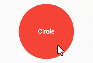
filling loading type:
-
Interactive Animation: Engage users with a button that responds to long presses, offering an interactive and visually appealing experience.
-
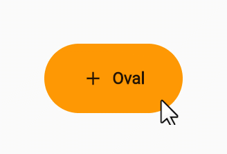
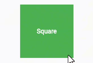
Customizable: Tailor the button to match your app's design by adjusting parameters such as button color, loading color, border radius, child widget, animation duration, and start position.
-
User Engagement: Encourage users to interact with your app by introducing a novel way to trigger actions.
-
Add the Holdable Button plugin to your
pubspec.yamlfile:dependencies: holdable_button: any
-
Install the plugin by running:
flutter pub get
-
Import the package in your Dart code:
import 'package:holdable_button/holdable_button.dart';
-
Implement the HoldableButton widget:
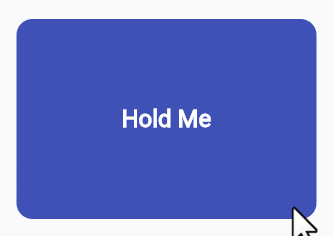
HoldableButton(
  loadingType: LoadingType.edgeLoading,
  width: 300,
  height: 200,
  buttonColor: Colors.blue,
  loadingColor: Colors.white,
  radius: 15.0,
  child: Text('Hold Me'),
  duration: 5,
  startPoint: 0.25,
  hasVibrate: true,
  onConfirm: () {
    // Callback when animation completes
  },
)
The HoldableButton widget supports the following parameters:
loadingType: the loading type: edgeLoading or fillingLoading.buttonColor: The color of the button.loadingColor: The color of the loading animation.radius: The border radius of the button.child: The widget inside the button.duration: The duration of the animation in seconds.startPoint: Start position in edgeLoading type.hasVibrate: Enable Vibration after loading complete.onConfirm: Callback when the animation completes.
Feel free to experiment with these parameters to achieve the desired look and behavior.
Contributions are welcome! Please feel free to submit issues or pull requests.