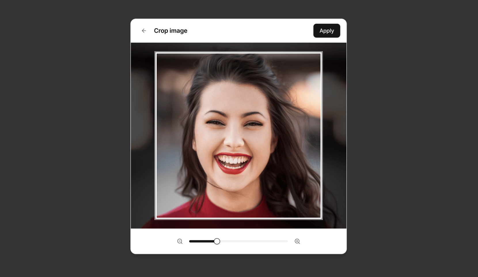
A simple, composable, headless React component for interactive image cropping — inspired by the experience on X.
- Headless & Composable: Provides building blocks (
Cropper.Root,Cropper.Image,Cropper.CropArea,Cropper.Description) for full control over structure and styling. - Interactive: Supports zooming (mouse wheel, pinch gesture) and panning (mouse drag, touch drag, arrow keys).
- Aspect Ratio: Enforces a specified aspect ratio for the crop area.
- Controlled/Uncontrolled: Manage zoom state internally or control it via props.
- Crop Calculation: Outputs precise pixel coordinates of the cropped area relative to the original image.
- Accessible: Designed with ARIA attributes and requires a description element for screen reader users.
- Customizable: Control zoom limits, sensitivity, padding, keyboard steps, and apply custom styles.
npm install @origin/image-cropper
# or
yarn add @origin/image-cropper
# or
pnpm add @origin/image-cropperHere's a basic example of how to use the Cropper primitive components:
import { Cropper } from "@origin-space/image-cropper"
import React from "react"

function MyImageCropper() {
  const [cropData, setCropData] = React.useState<Area | null>(null)

  return (
    <div>
      <Cropper.Root
        image="https://images.unsplash.com/photo-1494790108377-be9c29b29330"
        aspectRatio={1}
        onCropChange={setCropData}
        className="relative flex h-80 w-full cursor-move touch-none items-center justify-center overflow-hidden rounded-md border focus:outline-none focus-visible:ring-2 focus-visible:ring-ring"
      >
        {/* Required for accessibility */}
        <Cropper.Description className="sr-only" />
        <Cropper.Image className="pointer-events-none h-full w-full select-none object-cover" />
        <Cropper.CropArea className="pointer-events-none absolute border-2 border-dashed border-background shadow-[0_0_0_9999px_rgba(0,0,0,0.6)]" />
      </Cropper.Root>

      {cropData && (
        <pre className="mt-4 overflow-auto rounded bg-muted p-2 text-sm">
          {JSON.stringify(cropData, null, 2)}
        </pre>
      )}
    </div>
  )
}
For more examples and integration with UI frameworks, check out the implementation on Origin UI.
Origin UI provides a pre-styled component built on top of @origin-space/image-cropper. If you're using Origin UI or want a quicker setup, you can use this abstraction.
Using the Origin UI abstraction simplifies the markup:
"use client"

import React from "react"
import {
  Cropper,
  CropperCropArea,
  CropperDescription,
  CropperImage,
} from "@/registry/default/ui/cropper"

type Area = { x: number; y: number; width: number; height: number }

export default function Component() {
  const [cropData, setCropData] = React.useState<Area | null>(null)

  return (
    <div className="flex flex-col gap-4">
      <Cropper
        className="h-80"
        image="https://images.unsplash.com/photo-1494790108377-be9c29b29330"
        aspectRatio={1}
        onCropChange={setCropData}
      >
        <CropperDescription />
        <CropperImage />
        <CropperCropArea />
      </Cropper>

      {cropData && (
        <pre className="overflow-auto rounded bg-muted p-2 text-sm">
          {JSON.stringify(cropData, null, 2)}
        </pre>
      )}
    </div>
  )
}Cropper.Root: The main container and controller. It handles logic, state, and interactions.Cropper.Image: Renders the actual<img>tag. It's positioned and scaled byCropper.Root.Cropper.CropArea: A simple<div>representing the visual crop area. You style this component to show the bounds.Cropper.Description: Renders a<div>intended for accessibility instructions. Itsidis automatically linked viaaria-describedbyon theRootelement. This component is required for accessibility.
| Prop | Type | Default | Description |
|---|---|---|---|
image |
string |
Required | URL of the image to crop. |
children |
React.ReactNode |
Required | Should include Cropper.Image, Cropper.CropArea, and Cropper.Description. |
aspectRatio |
number |
1 |
The desired width/height aspect ratio (e.g., 1, 1.5, 4 / 3, 16 / 9). |
cropPadding |
number |
25 |
Minimum padding (in pixels) between the crop area edges and the container edges. |
minZoom |
number |
1 |
Minimum zoom level (1 = 100% original size relative to crop area). |
maxZoom |
number |
3 |
Maximum zoom level. |
zoomSensitivity |
number |
0.005 |
Multiplier for mouse wheel delta to control zoom speed. |
keyboardStep |
number |
10 |
Number of pixels to pan the image when using arrow keys. |
zoom |
number |
undefined |
Controlled zoom level. If provided, component zoom state is controlled externally. |
onCropChange |
(pixels: Area | null) => void |
undefined |
Callback function triggered whenever the crop area changes. Receives pixel data or null if invalid. |
onZoomChange |
(zoom: number) => void |
undefined |
Callback function triggered when the zoom level changes interactively. Essential for controlled zoom prop. |
className |
string |
undefined |
CSS class for the root container element. |
style |
React.CSSProperties |
undefined |
Inline styles for the root container element. |
| ...restProps | Any other standard HTMLDivElement props are passed to the root container. |
The Area object received by onCropChange contains the following properties relative to the original image dimensions:
x: The x-coordinate of the top-left corner of the cropped area.y: The y-coordinate of the top-left corner of the cropped area.width: The width of the cropped area in pixels.height: The height of the cropped area in pixels.
It is crucial to include a Cropper.Description component within Cropper.Root. This provides necessary context for screen reader users about how to interact with the cropper. If you don't provide one, a warning will appear in the console. You can visually hide the description using standard CSS techniques (e.g., an sr-only class).
The component is headless, meaning it doesn't come with built-in styles beyond basic positioning for the image. You are expected to style the Cropper.Root, Cropper.Image, and especially the Cropper.CropArea using CSS classes (className) or inline styles (style) to match your application's design. The Cropper.CropArea typically needs styling to appear as an overlay (e.g., border, semi-transparent background outside the area).
MIT